Monooframe

Wallex

A crypto exchange
from first sign-up
to first trade

The challenge

Wallex is one of Iran’s best-known crypto exchanges, with more than five million people signed up, over 320 markets and instant buying across 230+ coins. As the product grew, the question was how to keep a young, fast-moving market feeling calm, trustworthy and easy to read.

We worked on the whole thing as one story: the brand, the website, the mobile apps and the trading screens, so that a newcomer and a day trader both feel at home, from the first sign-up to the first trade.

Product goals
and objectives

Product goals
and objectives

We set three goals. Make trust visible: a confident mark, plain language and the security people look for, with most funds in cold storage, two-factor sign-in and full identity verification. Make speed obvious: an account in minutes, instant buying and selling, and a professional trading screen for people who want charts, orders and leverage. And make it one family, with the same colours, type, illustrations and icons on the website, in the apps, on social media and in print.

Mobile and desktop,
designed together

Every screen,
twice

Every screen exists for the phone and for the desktop: the coin page with its live price and chart, the trade screen with order book, candles and a buy and sell form, and the identity verification flow. They share components and states, so a layout that works on a phone grows into a desktop one instead of being drawn again.

A visual language
for money

Illustration

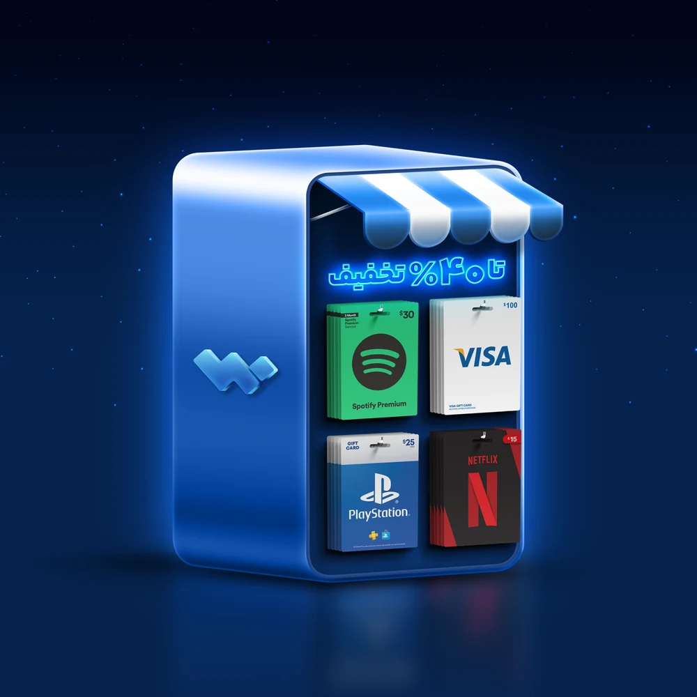
Next to the interface we drew a family of glowing 3D illustrations in the brand blues: a gift-card shop, coins crossing a portal, a trading bot, a tunnel of markets and a stopwatch for fast trading. Each one turns a feature that is hard to explain into a single picture.

The Wallex mark: two blocks locked together into a W, in white on the brand’s deep navy
Instant swaps: coins fly from one wallet to another through a portal
The trading bot: automated strategies that keep working while you are away
A gift-card shop inside the exchange: Spotify, Visa, PlayStation and Netflix cards, bought with crypto
High-frequency trading: speed measured in fractions of a second

Apps for
every phone

Mobile apps

Wallex lives on Android and iOS as well as the web, and the download page shows it that way: a metal device with an Apple and an Android button glowing around a phone that runs the app. The same wallet, markets and trade screens follow people from one device to the next.

A mark that
carries trust

The logo

The Wallex mark is a bold W built from blocks and squares. The shapes carry several meanings at once: stability and boldness, a person, a door, the candle bars of a trading chart and a mobile device. Together with the wordmark it reads as strong and trustworthy, and it comes with clear-space and minimum-size rules, one-colour versions and a list of what not to do, so it stays recognisable from a favicon to a billboard.

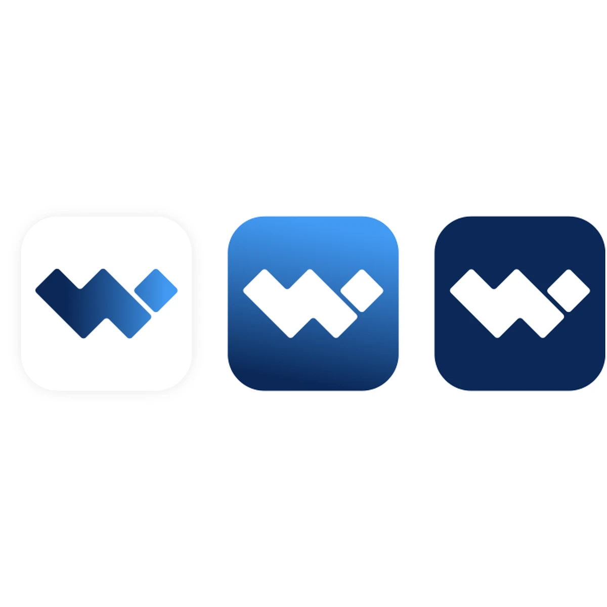
The app icon in three finishes: white, gradient blue and dark navy
A pixel pattern built from the mark’s own shapes, used softly for backgrounds
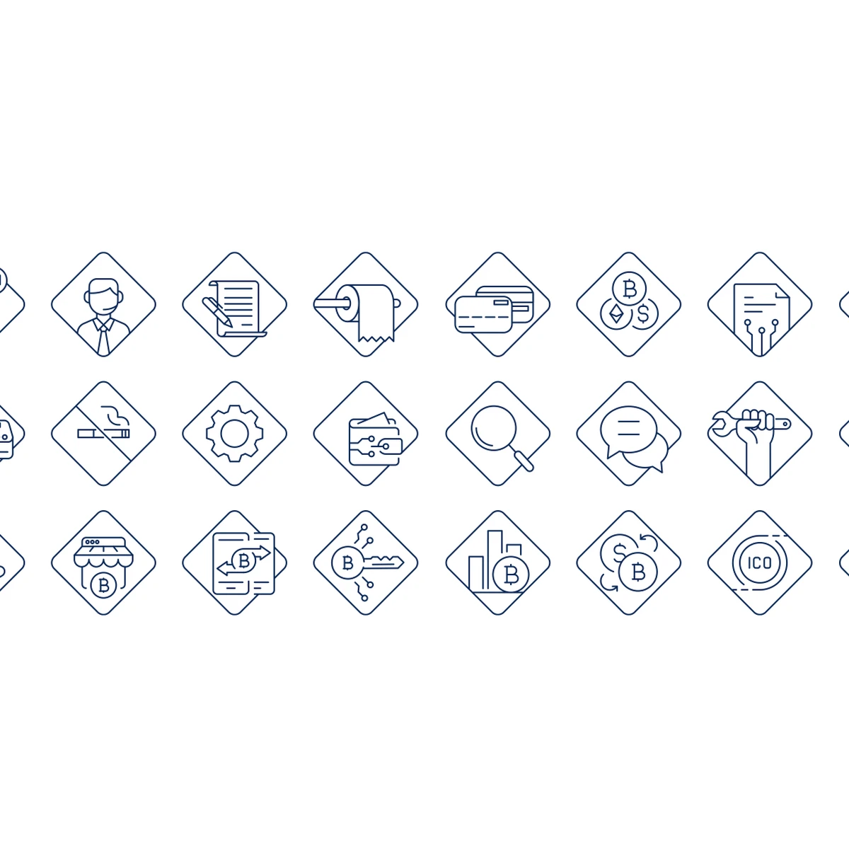
A set of line icons drawn inside the diamond of the mark
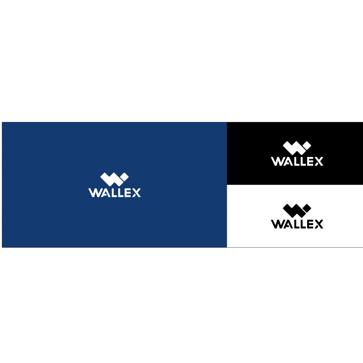
The mark on dark cerulean, black and white
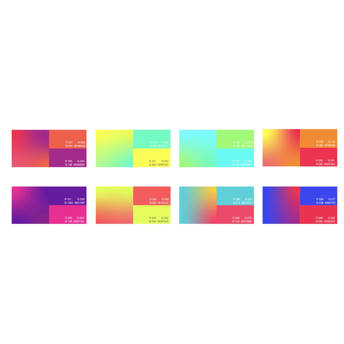
Bright gradients for screens and social, never for print

Colour, type
and pattern

Colour and type

Dark Cerulean is the main colour, a medium-dark cyan-blue that signals trust, with Brilliant Azure as its lighter partner and a secondary palette for charts and states. Helvetica sets English and Yekan Bakh sets Persian, so both languages speak in one voice. The pattern and the gradients give backgrounds depth without adding noise.

The identity,
beyond the screen

Beyond
the screen

The system was designed to travel: app icons and profile pictures, email signatures and letterheads, business cards, folders and bags, banners, caps and polo shirts, and billboards.

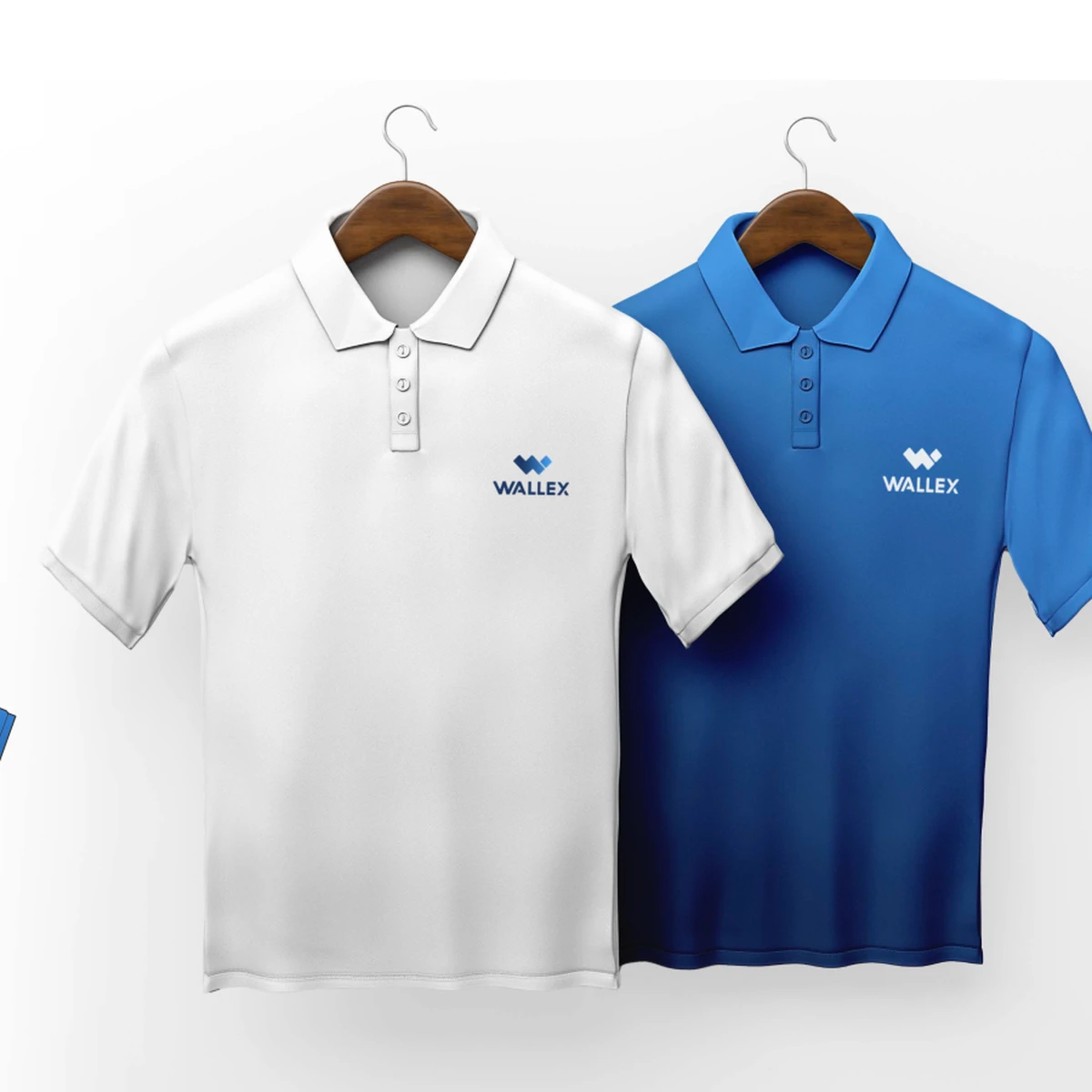
Polo shirts in white and brand blue
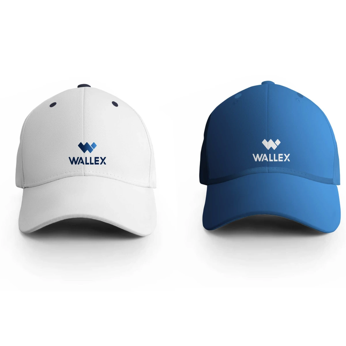
Caps, in white and blue
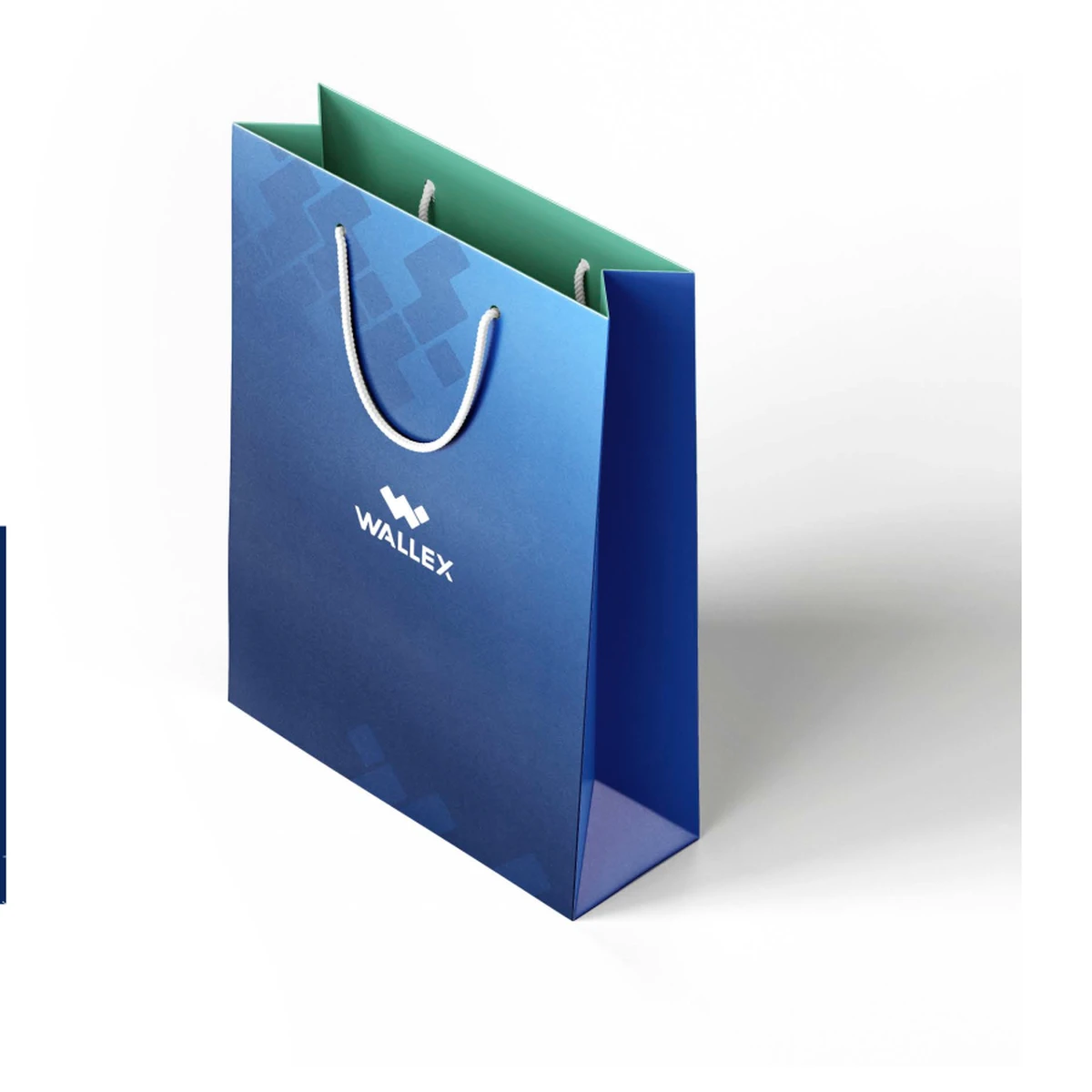
A shopping bag that carries the pattern
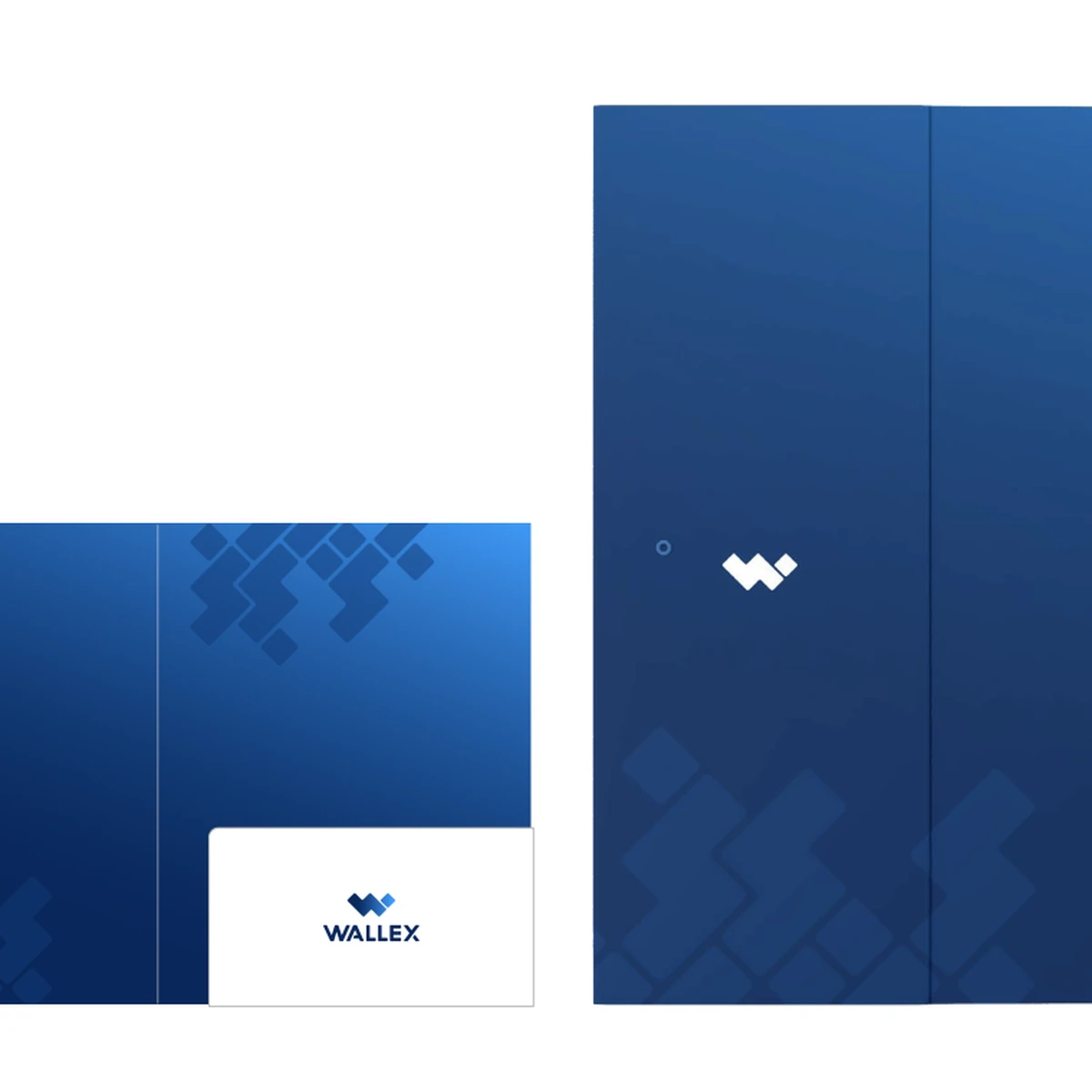
A folder, a letter and a card
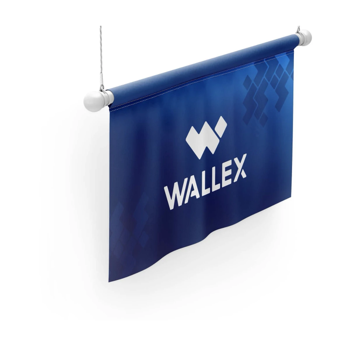
A banner with the mark on the pattern

Photography,
illustration, social

Photography and
illustration

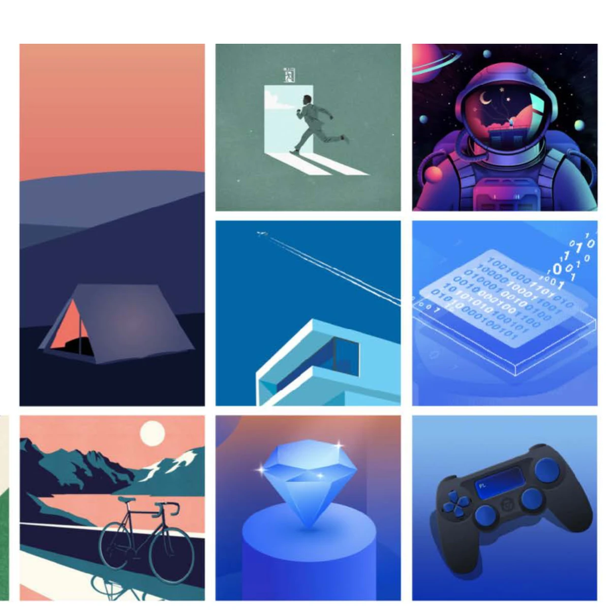
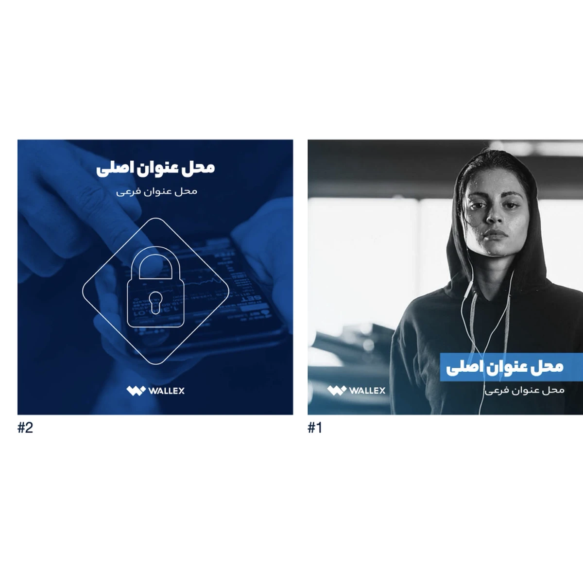
Photographs are confident and candid, never staged. Illustrations are modern flat vector with a retro touch, in the brand blues. Posts, stories and the LinkedIn page follow the same templates, so everything that carries the Wallex name looks like it came from one hand.

Illustration style: flat vector, vintage and modern at once, in the brand colours
Social posts with an illustration or a photograph and the Persian headline
Next project